Posts made in February, 2016

My Watercolor Portrait Workshop: quick recap + snaps

Last Saturday I had the privilege of teaching my first watercolor class on portraits. If anyone told the me of 2015 that I’d be holding workshops in a year’s time, I would have laughed in their face. Seriously, it took me a lot of thinking, overthinking, and convincing to finally crawl out of my comfort zone and gather the confidence to actually go and do it. Why? Because workshops are the new ballet lessons? Well …yes (*sheepish smile*) but also because I’ve gained so much from being part of Manila’s growing handmade art community so it’s time to give back. <3 And why not share what I’ve learned over the years decades that I’ve been drawing faces to budding artists who share the same passion for creating?

But first, credit where it’s due. The first and only drawing-related workshop I ever attended is veteran artist Fernando Sena’s Summer Art Workshop way back in 1986. Believe me that was enough. (He still conducts these workshops, do check them out.) It was an intensive 8-session art course (complete with an on-site sketching session at Hinulugang Taktak in Antipolo, a “graduation” and an exhibit) while I was between 2nd and 3rd year high school and that was where I honed my drawing skills. I learned how to use graphite, charcoal, oil pastels, and even oil paints. It completely prepared me for the courses in the UP College of Fine Arts that I would eventually take. 🙂
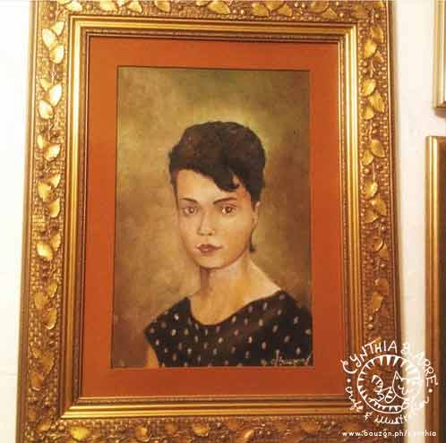
oil portrait painting by cynthia bauzon arre

An oil portrait painting I made of my Tita Lina back in 1986. My Ate Peach sent this pic to me via IG. Haven’t seen it in years since it’s in their family home in Sydney. 🙂

After that I’d do charcoal and oil portraits of relatives, friends, and the random 80s teen hearthrob (i.e. River Phoenix, Scott Baio, Robby Rosa… I know, so very #titahits). It was only last year when I picked up the old hobby again and taught myself how to do it using watercolors by watching Youtube videos and reading tutorials. I would also observe Arnold whenever he drew and applied some of his digital sketching techniques to my analog work. And that’s how I developed a watercolor portrait style that I’m quite happy with — and that’s what I shared and demonstrated in my class last Saturday.

It was held at Hey Kessy, a cute little art and crafts store in Katipunan which also houses a charmingly decorated brightly-lit workshop venue. It’s also where I did the Shrink Art workshop last year. I love the place’s artsy, creative vibe so please expect more workshops from me in the space.

Some photos of what went on…

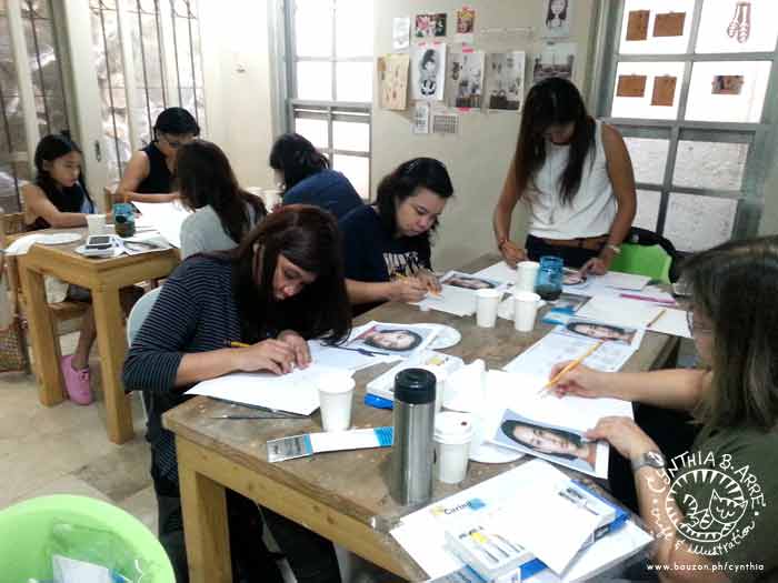
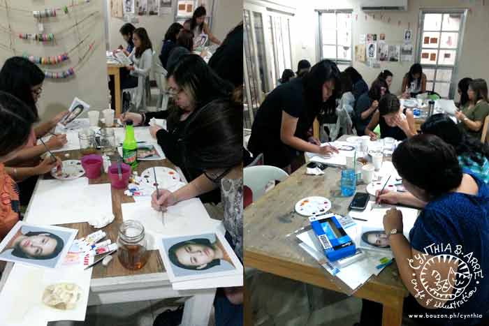
watercolor workshop portraits

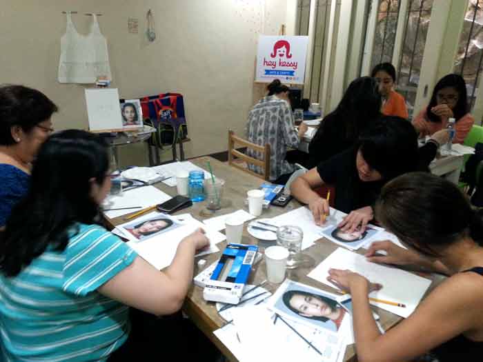
I thought it was important for them to learn face-drawing basics first so I guided the participants on how to do it then let them apply what they learned when sketching from a reference photo. *I just had to pick Kiko Mizuhara as our practice model. How pretty is she?

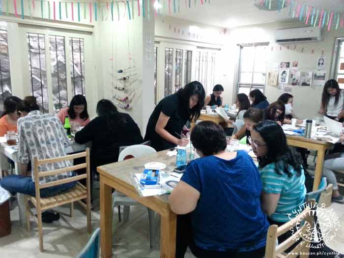
watercolor workshop portraits watercolor workshop portraits philippines

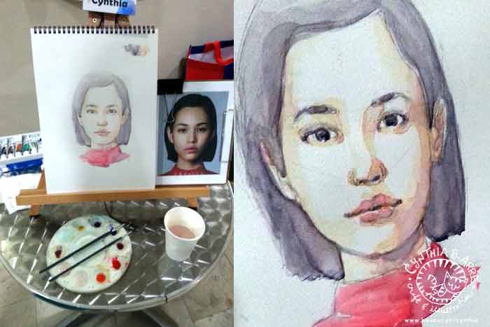
After we were happy with our respective pencil drawings, we started painting. Below is the result of the face I sketched and painted on-site. Admittedly, this was the part I stressed over for weeks since I’ve never drawn in front of an audience before — can I do it fast enough? Will it turn out okay?

watercolor workshop portraits manila

Below: everyone hard at work on their paintings.

watercolor workshop portraits quezon city

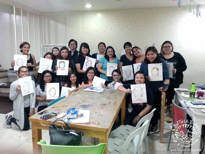
And finally, the result of everyone’s efforts — yay, class photo!

watercolor workshop philippines

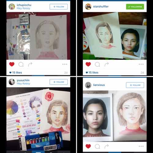
A few of the participants are illustrators like my friend Jovan de Ocampo who’s a cake designer and longtime member of AngINK; some are young art students looking to hone their portrait skills, and some are new to watercolors and admitted that they’ve never properly drawn faces before. But look at their outputs above and below, they did it and I think some of their own styles are already emerging! I’m so proud of them. 🙂

workshop participant works

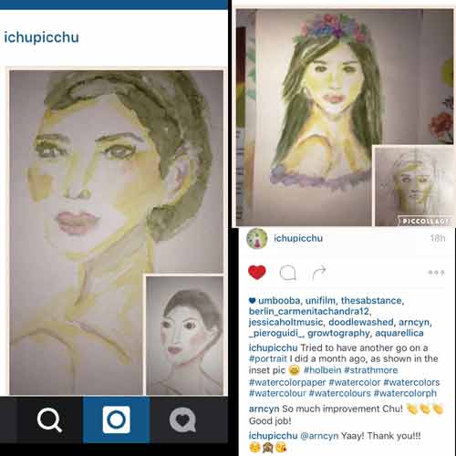
One of the participants, Chu, even shared a before and after photo (below, left)  of a portrait she made a month ago (inset) and her work after she took my workshop.

workshop student works

The other drawing (aboce, right) is a portrait wherein she used a technique I taught them. So happy to see so much improvement in such a short time!

You can keep track of my workshops and student outputs via the hashtag #cynarreworkshops on Instagram. I will definitely hold another class like this soon so if you’d like to join the next one, please leave a comment on this post + your preference of area (QC / Makati) so I can update you once I get hold of more details. 🙂
Share
Read More

My favorite watercolor papers

I recently blogged about my watercolor paints and brushes in two parts — ONE / TWO

However, what good are those wonderful paints and brushes for without beautiful, high-quality paper? For daily practice work, inexpensive student quality pads like the Canson papers with the hot air balloon drawing on the cover that you can find at NBS and a Monologue Sketchbook (which I’ve also been abusing using) are great to have around but for commission work, it’s more appropriate to use paper that will allow illustrations to shine and last for a long time.

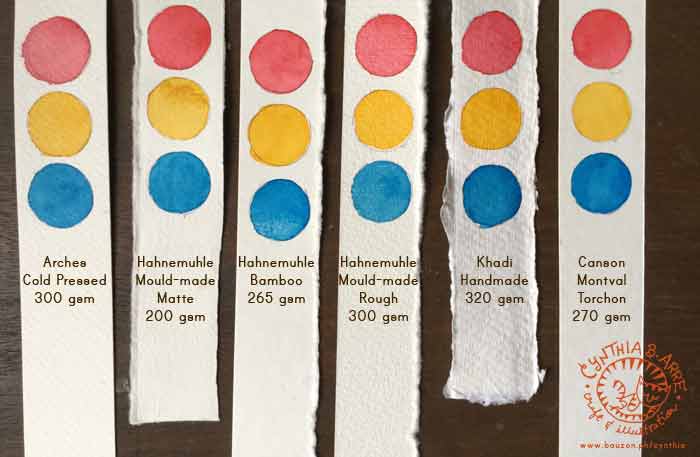
Here are some of my staples (so far) along with close-ups of samples of my illustrations using the different papers so that you can see their textures up close as well as how colors respond to them

.comparing watercolor papers

L-R and in no order of preference, these are the paper brands I keep going back to: Arches, Hahnemuhle, Khadi, and Canson. I’ve been hearing good things about Fabriano and Strathmore too but I have to wait for my shipment to arrive so I can try them out. The red, yellow, and blue paint I used for the comparison shot above are Shinhan PWC Permanent Red, Cadmium Yellow Deep, and Peacock Blue (from ArtWhale).

All of the above are acid-free and, save for Canson Montval Torchon which uses 100% cellulose, are fine artist quality papers made of natural fibers like cotton rag and bamboo in Hahnemuhle Bamboo Mixed Media Board’s case. Below are some notes:

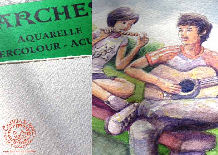
arches watercolor paper sample work

Arches Cold-Pressed Cotton Watercolor Paper, 300 gsm (available at NBS and some Fully Booked branches though I got mine from Amazon.com)

I prefer cold-pressed to hot-pressed watercolor papers because I love the rough texture which IMHO lends an organic feel. Arches 100% cotton paper has a nicely coarse “tooth” that seems to absorb pigments easily which allows colors to remain vibrant and intense. I’m also able to paint big juicy washes and draw fine details with minimal buckling, even when I don’t stretch the paper (which I really usually don’t, being lazy). At 300 gsm, it’s also thick enough to handle re-wetting with no visible damage when I make mistakes. 😛

***

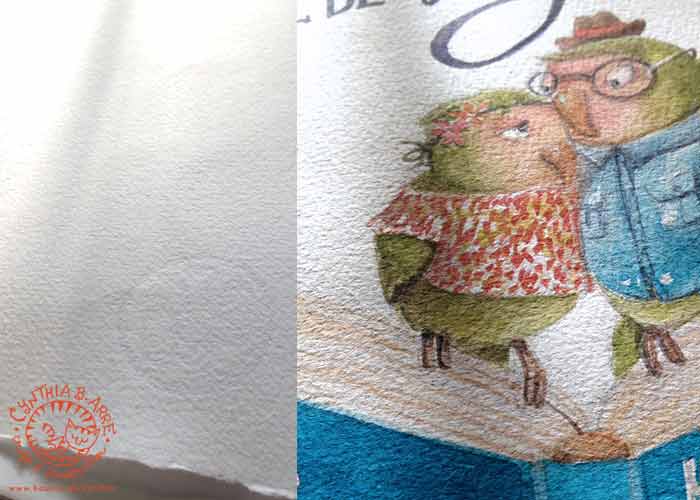
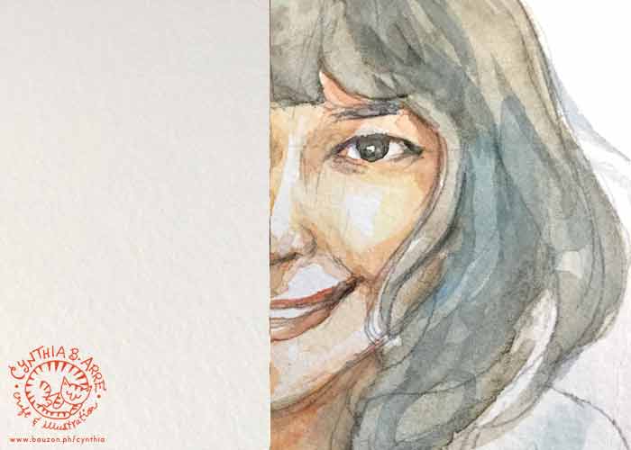
Hahnemuhle matte watercolor paper

Hahnemuhle Mould-Made Watercolor Paper (Matte), 200 gsm (available at Deovir Arts)

Arnold introduced me to this paper so it was the first “fine art” paper I ever used. (I’m a bit embarrassed to admit that all of my watercolor work from years ago were done on yellow-backed illustration boards and sketch pads). Because of that, this has become my “benchmark” paper. It’s awesome for wet-on-wet painting (the paper drinks up the water & pigments without diminishing color vibrancy) and as you can see above, I can also do crisp-edged drawings on it with no problems. At 200 gsm, I avoid painting large washes though it may be possible if stretched beforehand. Mistakes are also easy to re-wet and “erase,” making it an ideal choice for beginners. It’s very economical to buy big sheets of these and tear them down to a more manageable size. The deckle edge is a nice touch and it’s inspired me to keep the torn edges when I tear it up into smaller pieces for a raw handmade look. 🙂

***

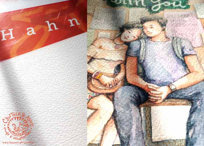
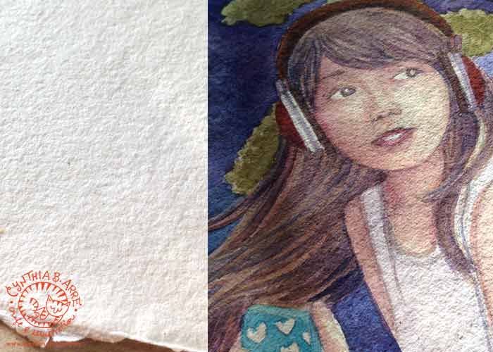
Hahnemuhle mould made watercolor paper rough

Hahnemuhle Mould-Made Watercolor Paper (Rough), 300 gsm (available at Deovir Arts)

This one comes in block form and has a rougher, slightly raised and woven texture compared to the matt variant. A block is very convenient since you can immediately apply large washes with no need for stretching. I found the weave-like texture off-putting at first since I was already used to the fine-grained fibrous texture of Hahnemuhle’s matt paper but after using this for a while. I learned to like it as well. It appears that the pigments sink and “sit” in the grooves and so deep, rich colors are preserved.

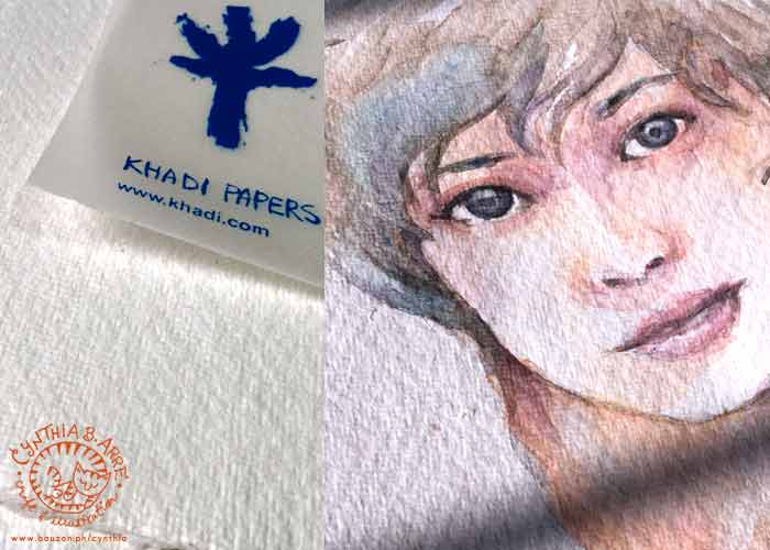
khadi handmade watercolor paper circle

Khadi Handmade Paper 320 gsm, circle (above) and A5 (below) — (available at ArtWhale)

At 329 gsm, this paper handmade in India is thicker than all the other natural-fiber papers I’ve tried and because it’s made of long-fiber cotton rag (upcycled t-shirt cuttings, anyone?), it seems to be more absorbent than the other papers. The painting above was done on the circle variant (which reminds me of pita bread 😉 ) months ago using ShinHan Korean Colors but because the pigments were fully absorbed by the paper, it looks as if it was painted just yesterday. Also, as you can see almost the entire surface is covered in watercolor but at 320 gsm, the paper didn’t buckle much and actually stiffened a bit once the paint dried — possibly because the rag combined with the pigments.

The A5 variant (below) has a slightly finer grain. Since my first artwork is almost opaque, I tried to see how the paper react to a transparent wet-on-wet technique and it performed beyond my expectations. 🙂 The paper was able to soak in a lot of water and it never once buckled. Also, just look at how rich the colors stayed even after the paint dried (I used ShinHan PWC paints for the test below). The A5 size is perfect for portraits too and the deckle edges add a beautiful handmade touch.

khadi handmade watercolor paper a5

***

hahnemuhle bamboo mixed media board

Hahnemuhle Bamboo Mixed Media Board 265 gsm (available at Deovir Arts)

This is an all-in-one artist-grade paper made from 90% bamboo fibers and 10% rag which can be used with watercolour, gouache, acrylics, colored pencils, chalk and oil pastel, stamp pad inks, etc. It comes in sheets at Deovir (for around P118 per 19″ x 25″ sheet) which is great value since you can cut it up into smaller pieces and it can handle almost any media. The surface is smooth and watercolor glides on it with ease. I like using this paper with the wet-on-dry watercolor technique since colors seems to maintain brilliancy that way.

***

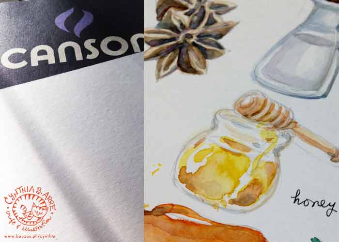
Canson Montval Torchon watercolor paper

Canson Montval Torchon Watercolor Paper, 270 gsm (available at NBS and Fully Booked)

Among relatively inexpensive student-grade papers, this is the closest I’ve found that can mimic the behavior of premium watercolor paper. Made from archival cellulose, the texture is similar to that of Hahnemuhle Bamboo’s — smooth but grainy enough to absorb paint and give paintings a “watercolory” look, meaning it won’t look like the paint is just sitting on top of the paper. At 270 gsm it’s not prone to much buckling unless you’re doing heavy-duty washes. Remember though that this isn’t fine art paper and drawings might eventually fade so make sure to use this only when you will scan and digitize your work.

I would love to know what brands and kinds of paper you like using. Please do share in the comments section. 🙂

See also:

Share
Read More

My watercolors, brushes, and painting tools (Part 2)

It’s time for PART 2 of this blog post from June of last year:  My watercolors, brushes, and other painting tools

Since that entry, I’ve added *just* a few more paints to my arsenal. Most of my watercolors at the time were student grade pan sets, but after practicing for months, I thought I deserved a good selection of artist grade watercolors that I can use for the commissions that were surprisingly starting to trickle in (thanks to my posting of work online). 🙂

After consulting with friends, doing lots of research on sites like Handprint and WetCanvas AND considering what I can afford, I chose the brands ShinHan PWC (Premium Watercolors) and Holbein. These two Asian brands are known for creamy, brilliant colors that are quite similar in behavior and quality. I chose tubes because I have a tendency to mix pan colors on the pans themselves and after a while, I can’t tell which is which anymore. Obviously I won’t have that problem with tubes if I squeeze out just enough for what I need at the time of painting.

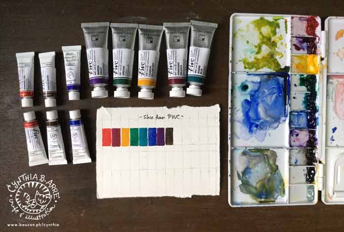
ShinHan PWC Extra Fine Artists Watercolor

ShinHan PWC Extra Fine Artists Watercolors in 5ml and 15ml tubes — Permanent Red, Vandyke Brown, Ultramarine Deep, Mineral Violet, Viridian, Cadmium Yellow Deep, Permanent Magenta, and Marine Blue. (Locally available from ArtWhale)

I already have a few tubes of the ShinHan Korean Colors which I already reviewed here and here. PWC is ShinHan’s top-of-the-line paint and is made with high quality pigments and the finest grade gum arabic which produces beautifully transparent but vivid, fade-resistant colors, as you can see in the swatches above. I also love how I can mix a variety of interesting hues from just those few colors in my palette.

And here’s a comparison test I did sometime ago where you can clearly see the difference between ShinHan Korean Colors and ShinHan PWC.

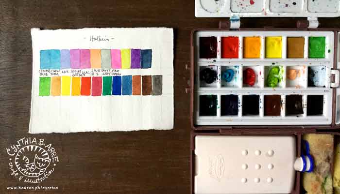
In my previous blog post, I mentioned that I already had a few tubes of Holbein Watercolors but that I haven’t really used them much because of the colors I picked. Since that time I purchased a travel set containing colors from their 12-tube set in pan form. The set also includes a little flask, two synthetic hair travel brushes, sponges, and receptacles for water for easy use when painting plein air.
holbein pro compo travel kit

Holbein watercolors in the Pro-Compo Mini II Travel Kit – Burnt Sienna, Chinese White, Crimson Lake, Permanent Green #1, Prussian Blue, Viridian, Burnt Umber, Cobalt Blue, Ivory Black, Permanent Yellow Light, Vermilion, and Yellow Ochre + 5ml tubes of Compose Blue, Cobalt Turquoise Light, Lilac, Violet Grey, Lavender, Jaune Brilliant #2, Opera, Leaf Green, Permanent Violet, and Indigo. (Available from Deovir Arts though my travel kit is from an indie seller on IG)

Holbein, like ShinHan PWC, is wonderfully creamy and vibrant and re-wets easily. Just dab your wet brush onto the dry paint and the color will leap into your brush like metal files to a magnet. 😀 It also produces beautiful transparent washes and intense hues. I’m very happy with my choice of paints.

Here’s something I painted entirely with Holbein:

A photo posted by Cynthia Bauzon-Arre (@arncyn) on

(Lots more on Instagram as always.)

And now for the brushes I’ve added to my tool kit —

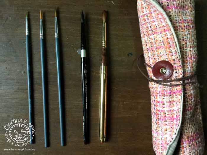
escoda silver brush black velvet winsor & newton brushes

From left to right: Winsor & Newton Foundation Brushes #2, 4, and 6; Silver Brush Black Velvet #8 , and Escoda Reserva #8 which I keep in a Tweed & Twine rollup tool case

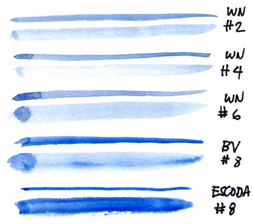
brush-tests002

  • The W&N brushes are actually from my workshop kits (so if you signed up for my Watercolor Portrait Workshop on Feb.20 at Hey Kessy, you’ll be receiving a set of these!). I got a set for myself from IFEX Philippines and I’ve been using them as an alternative to my W&N Series 7 Kolinsky brushes since I don’t want to wear those out. These ones are synthetic and have a good snap to them, making them excellent for detail work! (Available at NBS & Fully Booked branches for only P185/set)
  • This Black Velvet brush is made of a blend of squirrel hair and synthetic filament and I find it very soft and absorbent. I love how the point stays in shape so I can make both fine lines and bold strokes with it. (Available locally from Craft Carrot though I got mine as a gift from a relative in the US)
  • The Escoda Reserva Kolinsky-Tajmyr Sable is my absolute favorite watercolor brush because it’s an all-in-one — it’s a travel brush so it can be collapsed. It also has terrific liquid-retaining capacity and the hair holds sharp points, making it perfect for juicy washes, bold strokes, and fine lines. Also, how gorgeous is that golden brass ferrule? (Available from ArtWhale)

See also: My watercolors, brushes, and other painting tools and My favorite watercolor papers

How about you, what are your watercolor painting must-haves? Please do share!


Share
Read More

I'm Cynthia Bauzon-Arre, a Filipino watercolor artist & graphic designer. I live in QC with my graphic novelist husband Arnold and our friendly marmalade tabby Abbas. This blog has been chronicling my life, likes, and loves since 2001. [ more ]

view my portfolio

Categories

Archives