art and design

Keeping Busy + Adventures in Shrinking Plastic

What I’ve been working on:

1. New patterns for my Spoonflower store (these are still being proofed so this is a sneaky peek) —

surface pattern design by cynthia bauzon arre

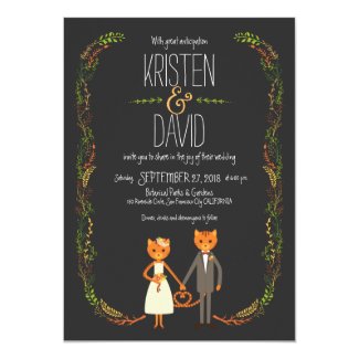
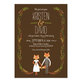
2. A new wedding invitation set featuring stylish animals —

(You can see all the elements of the entire collection here)

3. More custom couple cartoons. (Nothing to show here yet as they’re still in the drafts stage but I’ll update the other blog once the drawings have been finalized.)

And as you may have seen on my Instagram feed,

4. Shrink plastic jewelry

I’ve been wanting to make accessories for the longest time. In fact I have an unused box full of jewelry findings hoarded from the Kamuning Market when we were planning our wedding… yes, it’s been that long! However, there’s so much competition and I didn’t know what I could do that would showcase what I can do best so i focused on other things. Until I discovered shrinky dinks — thanks to wedding blogging actually. Some of my brides would talk about shrinky-dinking stuff and I was all like “shrinky-WHAT-ing?” (( Not sure if art schools here are using it now but I’ve never encountered the stuff.)) After much Googling and Youtube-ing I learned that specially made plastic can shrink into a harder & thicker version of itself if you stick it in a regular toaster oven. A little light bulb lit up in my head — what if I shrink my illustrations and make them into few-of-a-kind jewelry charms? Of course I still had no idea then that I was already late to the game and that there’s already a whole movement devoted to shrink plastic jewelry on Etsy. [insert embarrassed emoji here] Still, I ordered a pack of Shrinky Dinks sheets from Amazon. That would take at least a week to arrive and I couldn’t wait anymore so when I learned that I can also shrink #6 plastic (essentially, plastic used for take-out containers) and yay, we had one on hand (( it had cake on it which I quickly, um, got rid off )), I did this experiment, again documented on Instagram.

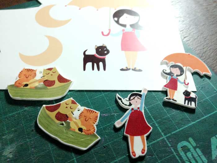
My shrinky dink-brand sheets (as well as a few unbranded ones) arrived in late December but I couldn’t play with them until this week. I got several types — white, clear, rough and ready – so I tried different combinations. Frosted sheets with colored pencils, white with sharpies. Here’s what came out of that experiment.

In the photo below you can see how big the original artwork is compared to the miniature version. You’ll notice that this time I printed my vector illustrations directly on the plastic sheet.

shrinkydinks jewelry

Some pieces already look good but I have yet to perfect shrinking the plastic without forming dents in the miniatures. This is all still a work in progress and I will update you once I come up with designs that I am completely happy with.

UPDATE: I made a YouTube video of how I make my shrink art pins!
Share
Read More

How I make digital graphics and choose color schemes

I first published this tutorial of sorts in my blog for Poptastic Tees (( the old t-shirt store a.k.a. our first foray into online selling )) but I accidentally deleted that entire site a couple of years ago. Too depressed to attempt reconstructing 5 years worth of blog posts, I dismissed it as fate and let it be.  Last night I found a set of graphics illustrating my work process step-by-step and thought of rewriting just that one post since it might be helpful and worth sharing.

So this is one of my patterns — “Retro Robots” — as seen on a Macbook sleeve c/o Zazzle.


I will now describe how I make almost all of my digital graphics. Sorry about the ugly watermarks.

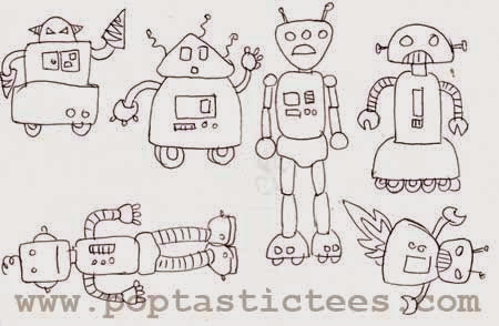
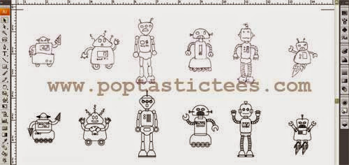
1. This step you already know: make doodles! Here are my robots.
retro robots by cynthia bauzon arre

2. Next step: scanning and making vector versions using Adobe Illustrator.
vectorize

The bottom row shows my robots in their “cleaned up” vector state but still raw and outlined. You’ll see that they’re simply made up of basic shapes like circles and squares with rounded corners that I just tweaked, duplicated, and assembled together to make robot-like forms based on my doodles. On hindsight, I should have just vectorized the drawings instead of constructing clean versions since the actual doodles look sillier and funnier!

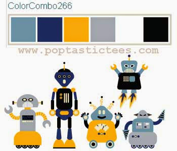
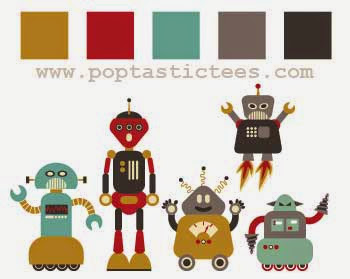
3. Here’s where the fun starts — adding color to the finished graphics. I like to use a palette of 4 or 5 colors only to give the design a cohesive and somewhat retro look. For color scheme formulating help, you can turn to a tool like Adobe Color CC‘s color wheel where you can make combos to your hearts’ content. (This blog post has a list of free tools for choosing a color scheme.)

choosing a color scheme

This nautical inspired colorway was my initial try. #meh

robots by cynthia bauzon arre

My second attempt was more successful, imho. I liked how the subdued colors made the robots look vintagey.

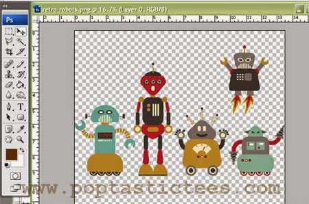
4. Time to play!

retro robots cynthia bauzon arre

Now my vector robots can be imported into Photoshop and arranged in several ways to make images for kiddie t-shirts or patterns for surface designing. 🙂

* See these robots in action in my shop Funky Patterns and on fabric / wallpaper in Spoonflower.

Share
Read More

On custom couple illustrations…

custom couple vector illustration

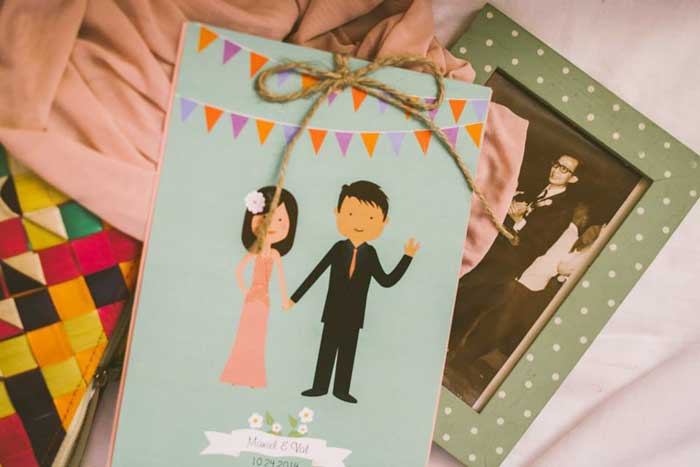
A custom couple illustration + wedding invite design for my friend Nyel and her hubby Val. (Photo by First Comes Rock.)

Last year I took the plunge and started accepting custom couple illustration requests for save the dates and wedding invitations over at my wedding blog. It was something I’ve been thinking of offering on the site for a few years now but I kept getting cold feet. Partly because I hear horror stories about custom work from my other designer friends, and also because I know how it is to be a bride-sometimes-zilla myself. I decided to go for it anyway and now, 6 months and more than a dozen couple portraits later, I’m actually glad that I did. Not only have I met such wonderful non-‘zilla-at-all clients (um, #blessed), I’m also able to flex my vector-crafting muscles and of course make some Christmas money on the side. 😉

I just updated the other blog so if you like you can now see some of the cartoon couples I’ve done. (GO)

Eventually I will accept hand-drawn couple portrait commissions for weddings too but right now I’d like to focus on these cartoons. 🙂

Share
Read More

I'm Cynthia Bauzon-Arre, a Filipino watercolor artist & graphic designer. I live in QC with my graphic novelist husband Arnold and our friendly marmalade tabby Abbas. This blog has been chronicling my life, likes, and loves since 2001. [ more ]

view my portfolio

Categories

Archives