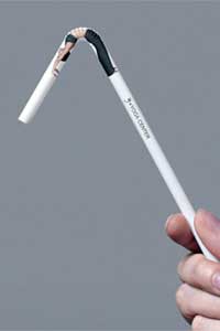
Non-trad ad for The Yoga Center.
.
In Non-traditional Advertising, ads are strategically positioned in the most unexpected places e.g. the sidewalk, a manhole cover, and as in the brilliant ((It’s so simple, it makes you go “why didn’t I think of that?”)) example above, a straw. The trick is in fusing your big idea with the 3D properties of the medium without making the proposition seem contrived ((I’ve actually seen it employed locally, some better executed than others though, but it’s good to know that the brand people are becoming more open to the non-conventional approach.)). On that note, I stumbled upon this really cool collection of Creative Ads Around The World I thought you might enjoy!
.
UPDATE: Mr. Katana of Hemmy.net is the real creator of the Creative Ads list, and not the webmaster of Eglobe1 like I originally linked to. Apparently Onion82 of Eglobe stole Mr. Katana’s entry and is passing it off as his ((Sigh, aren’t we all victims of intellectual property thievery lately.)). Read more about it here.
***
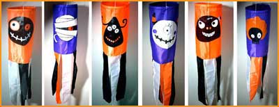
Heyheyhey, why don’t you deck out your windows with these dooper-cute Halloweenie windsocks our good friends Nina and Carlo designed ((They’re sooo cute! I’m guessing that sock #s 1, 3, 4, and 5 are by Nina and #s 2 and 6 are by Carlo, correct?)) :

They’re available in Maxitoylab Alabang Town Center and Maxiworks Powerplant Mall in Rockwell. They’re made of nylon, are 2.5 feet in length and 18 inches in diameter, and cost P150 each. Grab one now, yes?
***
It’s been said time and again that imitation is the sincerest form of flattery. Last July, our 2-year old magazine Wedding Essentials came out with a Special Issue called WE Beautiful Weddings featuring 25 real wedding stories and photos submitted and written by actual brides. We even included a “supplier box” listing down all the vendors each couple worked with.
.
Fast forward to this month: look what our more-than-5-year-old rival mag did. For their, um, version, they also asked brides to write the stories themselves — something WE has been doing since the very first issue. At least the art direction is different but the overall concept and format was copied right down to the supplier box. ((The only difference is that ours was a true labor of love and not something borne out of marketing warfare. ;))) Well, well, well, how utterly flattering! 😉
.
So if you love WE, pretty please wait for our next issue and do feel free to take a peek at the behind-the-scenes action via my phlog.
***
Arn and I will be away from home ((…and our dear little Abbas 🙁)) for a couple of weeks but I’ll see if I can post from where we’ll be. Seeya. 🙂


